TJA Client
RIP cannabis
Deliverables I worked on
Brand identity
Website
packaging
Industry
Cannabis
-
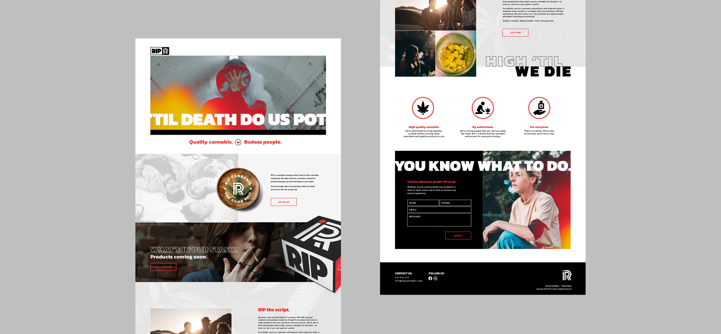
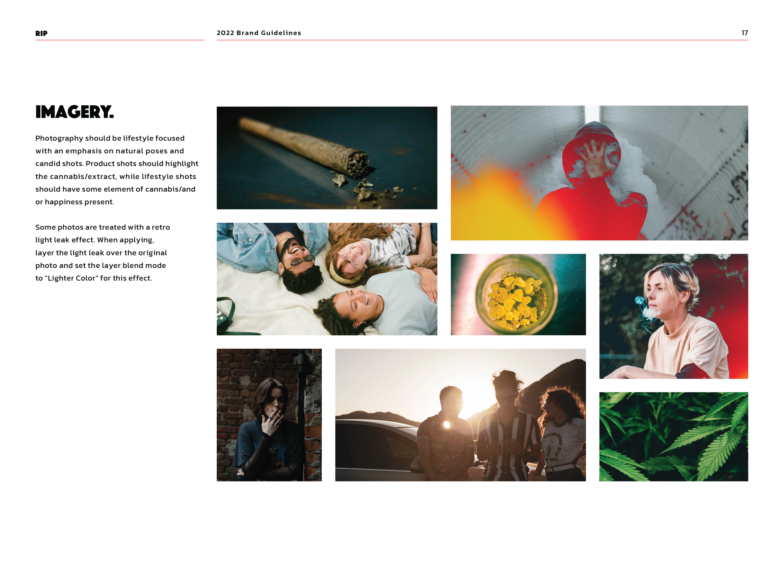
I was given the opportunity to take over this project immediately after the logo’s approval with the full support of a team ready to break the rules. Our eyes were set on creating a unique & edgy look for this up-and-coming cannabis company.
Taking notes from the client in its color palette, a simple yet striking red, white and black made its appearance throughout the identity.
-
Aiming for an inviting, playful yet refined, edgy, and hip look, we pushed every aspect of the brand.
Inviting their audience to RIP their heart out with a unique unboxing experience. Coating photos with a red/orange hue similar to the light cast when sparking up. Applying the logo to every corner of the box to be loud amongst the crowd.